Last.FM Chart Arcs
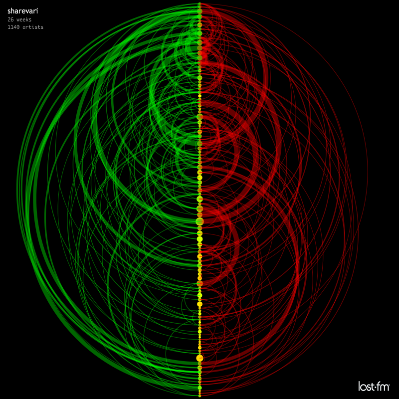 Over at Last.FM, MartinD has created some visualizations of the music listening
behaviors of various members of the Last.FM. The charts are quite attractive (although perhaps
somewhat difficult to interpret). The charts were made with
everyone's favorite visualization tool - processing. First seen on Information Aesthetics.
Over at Last.FM, MartinD has created some visualizations of the music listening
behaviors of various members of the Last.FM. The charts are quite attractive (although perhaps
somewhat difficult to interpret). The charts were made with
everyone's favorite visualization tool - processing. First seen on Information Aesthetics.