Visualizing last.fm
 .
.
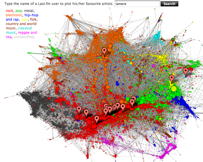
Update: There's a super-zoomable version on the seadragon gallery page. I can't figure out how to directly link to the image ... It is the 5th one from the right. The plot is created by crawling the similar artist graph of Last.fm (starting with Nightwish of all places) using the last.fm audioscrobbler webservices. The artists are arranged on the graph using a DrL graph layout algorithm (DrL is a force-directed layout algorithm that works with very large data sets. More info about this algorithm can be found in this paper ). The nodes in the graph are colored based upon the most frequent tags, while the edges are colored based upon their 'betweeness centrality score'. The area of a node in the graph is approximately proportional to the popularity of the artist.
Nepusz has also created an interactive map that allows you to type in the name of a few artists to see where they live on the map - or you can just enter your last.fm user name and it will show you where all your favorite artists are in the world of music.
The layout algorithm does a pretty good job of showing the large scale structure of the artist space. Artists with similar genre tags are well clustered. The ability to see where a particular artist is located on the map is very nice and the last.fm user integration is particularly sweet. Interesting too, is how the popular artists seem to be clustered in the graph. The larger vertices in the red-rock area form a very tight line. This may be an effect of using the Last.fm artist similarity which has a popularity bias (the top 10 artists similar to the beatles are all very popular artists).
What I really wish I could do is to use these plots for music discovery -
I'd like to be able to mouse over a vertex to see what the band is (and
even be able to listen to the band). It would be really interesting,
for instance, to explore the point where the electronic and the rock
world meets (like in the subsection of the graph shown here on the left -
what artist is represented by the large orange node?).  It'd be interested to see what the outliers are (I wonder what this
reggae/ska artist is doing near the jazz, as seen in the subgraph on the
right).
It'd be interested to see what the outliers are (I wonder what this
reggae/ska artist is doing near the jazz, as seen in the subgraph on the
right).  I'd like to be able to zoom in and see some of the finer structure (if I
zoom in on the Nightwish neighborhood, do I find more finnish, gothic
metal?).
I'd like to be able to zoom in and see some of the finer structure (if I
zoom in on the Nightwish neighborhood, do I find more finnish, gothic
metal?).
I'm a sucker for such visualizations, I think they can be a powerful tool for helping people to understand and explore a music space, and they can reveal relations and structure that are not evident in simple lists of similar artists. But creating these visualizations are not easy. Without special care they can easily turn into meaningless blobs. Nepusz has done an excellent job finding the right embedding algorithm, color and sizing strategy for the data. I hope he continues to add interactivity to his plots. Well done.
I guess JQuery could be better but there is a lot of artist there. Never the less, I am surprised of how neat is the plot with only two dimensions.
And yeah, I would like to zoom to see what groups are those in the very right of the map.
Posted by Luis on November 17, 2008 at 01:33 PM EST #
Maybe you'll also be interested in trying out this other last.fm artist visualization/browsing tool: http://pattie.fe.up.pt/RAMA/
Data visualized are artist similarities, common tags, specific tags, and artist popularity. Be gentle, that's still work in progress...
Posted by fabien on November 18, 2008 at 08:53 AM EST #
Hey Paul, Tamas already finished his PhD, and he now works at Last.fm :-)
Posted by elias on November 18, 2008 at 10:53 AM EST #
I'd like to add that visualization that Fabien posted is really cool.
Posted by elias on November 18, 2008 at 11:04 AM EST #
Hi Paul and thanks for the suggestions. As a zoomable variant is clearly one of the most popular feature requests, I seriously started to think about how it can be implemented. I already have a very large rendering of the whole artist map - in fact, I can't even view it on my laptop as I run out of memory :) I'm thinking about a Google Maps style user interface and I'll try to play around with it when I have some spare time. In the meanwhile, I added a downloadable 5000x3500 variant of the graph visualization which also includes some of the artist names on the map.
By the way, that ska/reggae artist near the jazz cluster is Manu Chao. I don't know his music enough to judge whether it qualifies as something similar to jazz or not, and the artist similarity data I used is more than a year old now, so it might end up somewhere else in the ska/reggae cluster in a recalculated version. Or maybe not :)
Posted by Tamás on November 18, 2008 at 04:40 PM EST #