Visualizing listening history
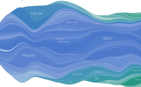
Lee Byron, a design/HCI student at CMU, has created this visualization of the listening history of a last.fm user. In this visualization, the x axis is time, and the y axis shows the number of plays associated with various artists. Lee calls this a 'layered histogram'. When plotted on paper, the visualization for 18 months of listening data is about 7 feet long. The visualization is fascinating way to view how one's listening taste changes over time. Lee's visualization reminds me of the Genealogy of Rock visualization that uses a similar (but hand drawn) layered histogram to represent the various artists and genres and how their popularities change over time. Lee also has some other examples of visualizing last.fm listening data. (Via Information Aesthetics)
Posted by Norman Casagrande on May 04, 2007 at 12:09 PM EDT #
Posted by Julian on May 04, 2007 at 06:40 PM EDT #
Posted by elias on May 05, 2007 at 07:14 PM EDT #